
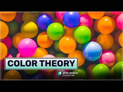
Color in Photography
The definition of color is a component of light that is separated when it is reflected off of an object. Color begins with light. The color we see is influenced by the characteristics of the source and what it reflects off. Wavelengths of reflected light determine what color we see.
Color is said to be three-dimensional because of its three unique aspects. When you seek to define a specific color, there are three properties to consider; Hue, Value, and Saturation.
- Hue is a name we give colors on the color wheel (red, yellow, green, orange, and so on). It’s the technical definition of color perception. Hues have a natural value where they look the purest and some colors, like yellow, are light. While other colors, like violet, are darker. All hues can be in all values. Adding white paint will make any pigment lighter creating a tint. Adding black paint will make most pigments darker creating a shade.
- Value is the light and dark property of a color, the luminance of additive color, and the tint or the shade of subtractive color.
- Saturation (also known as purity) is the level of grayness present. The less saturated, the more gray a color appears.

There are two main aspects of color in
When we look at a screen or monitor of any kind, we see additive color. The primary additive colors are red, green, and blue. RGB. Looking at anything that does not project light, we see reflected color known as subtractive color. This is with almost anything other than monitors and lights. The primary subtractive colors are red, yellow, and blue. RYB.
According to the Merriam-Webster dictionary, a primary color is any set of colors from which all other colors can be derived. Primary colors are pure and cannot be created by mixing other colors.
There are two important ways of understanding color in
Many photographers take great images without much understanding of how color in
Color Theory in Photography
Camera Versus the Human Eye
The sensor in a digital camera records light as it actually is. It then saves it unaltered as a RAW file or manipulates it when saving jpg files. Your eye/brain, however, will always correct light back to “normal” and our brain is constantly compensating to what it sees. Your camera does something similar when you have the white balance setting on auto.
The number of photoreceptors in a human eye is approximately 130 million rods and 5 to 7 million cones. If you assume a single pixel is equivalent to a rod, you could say it would take a 130-megapixel camera sensor to equal the human eye’s resolution. But there is much more to the story because the eye does not work the same as a digital camera. It’s not a perfect comparison. That is … if you are inside a place lit with tungsten light bulbs, those bulbs actually transmit a reddish-orange light. White objects will record as reddish-orange if your camera’s white balance is set to neutral. However, your brain will correct that light, and a white object will appear white.
Related article: Light and the Human Eye
The white balance on your camera filters the light, so white will be seen as white. When there’s a correct balance, the camera will record colors as you see them. If the white balance on a digital camera is not set for the lighting conditions, white and any color will not look right. This is because a filter is applied to balance the light when it contains a warmer or cooler tone.
Film photographers must use a filter on the lens when taking photos to correct color temperatures.

Understanding Light and Color
The color of the subject is determined by the color of the light source and the color of the subject. Your brain is constantly compensating. That is … if you are inside a place lit with tungsten bulbs, those bulbs transmit a reddish-orange light. White objects will be recorded as reddish-orange. But your brain will correct that light, and you will see a white object.
The same thing happens inside a place illuminated with fluorescent light. Fluorescent lights usually transmit an ugly blue-green light, and some types transmit a warmer tone. But your brain corrects that light, and it appears white to your eye. Your camera records the color the light casts and may correct it with the white balance.
White LED lights also vary in the color temperature of light they emit. Some are neutral, others are warm, and some give off a cool white light. The differences are subtle. Many people will not notice them unless there are two different temperature light sources close to each other. This is more noticeable when we take photos. Even with an auto white balance setting on your camera, it cannot compensate. When there are lights of more than one color temperature, the white balance can only correct one.
So, when you are taking photographs of an interior scene with the lights on, you need to make sure all the light sources are the same color temperature. If there’s any daylight affecting the exposure, you must ensure all the lights are daylight balanced.

Red, Green, and Blue vs. Red, Yellow, and Blue
Red light rays only contain red because it is a primary color. Green rays only contain green. Blue rays only contain blue. That is because these are primary additive colors.
Magenta, cyan, and yellow are the secondary additive colors because each one is a mix of two primary colors. Mixing primary and secondary colors will give you tertiary (third tier) colors. Together these make up all the visible colors in the spectrum.
The red pigment absorbs every colored light except for red light rays. The blue pigment absorbs all by blue light rays. Yellow absorbs all the yellow rays. So these are how we see subtractive colors because other colored rays are subtracted from what we can see. These are the three primary subtractive colors we see when light reflects off things.
Mixing any two of these primaries makes a set of tertiary colors. These are orange, violet, and green. These are the colors of a traditional color wheel. From this basic set of colors, all other colors can be mixed.
You can see how primary colors and secondary colors mix in the diagram below:

We must learn the colors of light and how the colors we photograph work together in our compositions. In
A key tip here is that it’s best to remember that when you are taking photos, think about red, yellow, and blue being the primary colors. The relationship between these and the secondary colors on the color wheel can affect any composition. For post-processing, think in terms of red, green, and blue. These are the primary colors of light, which we see looking at an image on a screen.
Color Photography and Composition
Color in photography composition is one of the main tools a photographer can use to create mood in their images. How you combine various colors or exclude them from your photographs influences how people might feel when they look at them. This is why understanding color in
How you frame a scene to include the right combination of colors can affect every aspect, from the photograph’s focal point to how viewers feel about it. Placing red and green objects next to each other will produce a different feeling than placing blue and green elements next to each other. You need to train your photographic eye in using color as best you can.
Because we naturally see color all around us, we can take it for granted. To use color well in your images, be aware of it. Look at the colors present in your frame as you are composing photographs. Would your image look better if you removed or avoided including something of a particular color? Would adding some color spice up your photo and make it more interesting?

Tips for Using Colors Well in Your Photographs
Think About the Color Wheel
How do the colors in your images relate to each other? Make use of complementary colors. These are opposite on the color wheel. Red and green. Blue and orange. Yellow and purple.
Think about primary colors and secondary colors. Use color to enhance your image. Do you want colors of strong contrast? These are the complementary colors. Or would more harmonious colors suit the mood of your subject better? These are called analogous colors and are located next to each other on the color wheel.
Cool colors and warm colors help create different moods in your photos. It depends on how you use the colors. For example, if you have a warm yellow against a blue sky, it will produce a bright summery feeling.

A green parasol would create quite a different feeling.

And a blue parasol would make a monochrome photo with an alternative atmosphere.

Use One Dominant Color
A popular technique amongst some photographers is to use one hue that is dominant in a photo. This use of color might be a photo of a red car in a green and brown forest scene. They will dominate against the softer colors of nature.
The contrast between bright and dark colors can also be used to make one color dominant. Saturation levels of colors in a scene may mean one will stand out more than others. Managing this well in your photos is the art of making a single color stand out.
For more tips on using colors well in your

Post Processing Color
Digital
To create photos that look most natural, you probably won’t post-process the colors in an image much at all. You’ll aim to make them look how you remember seeing them when you took the photographs. Nature and landscape photography look more realistic when the color is unmanipulated.
Maybe you want to create a surreal-looking image. Changing how the color looks is a sure way to make changes to how an image looks. You can tweak the color a little, or you can change it completely. It’s possible to make complementary colors look like monochrome or analogous colors if you have the skills.

Photography is Art
There is no right or wrong way to use color in
Understanding some color theory, both the color you photograph and the color you edit, will help you use it more creatively in your photographs. The key is to understand enough and put it into practice frequently so you can subconsciously make it part of your


